A 100% stacked area chart shows quarterly sales mix without extra DAX measures
You have a Power BI semantic model named Model1 that contains two fields named Sales and Quarter. Model1 contains a DAX measure that sums the Sales column. You need to create a report that will contain the visual shown in the following exhibit. The solution must NOT require additional DAX measures. Which type of visual should you use? - 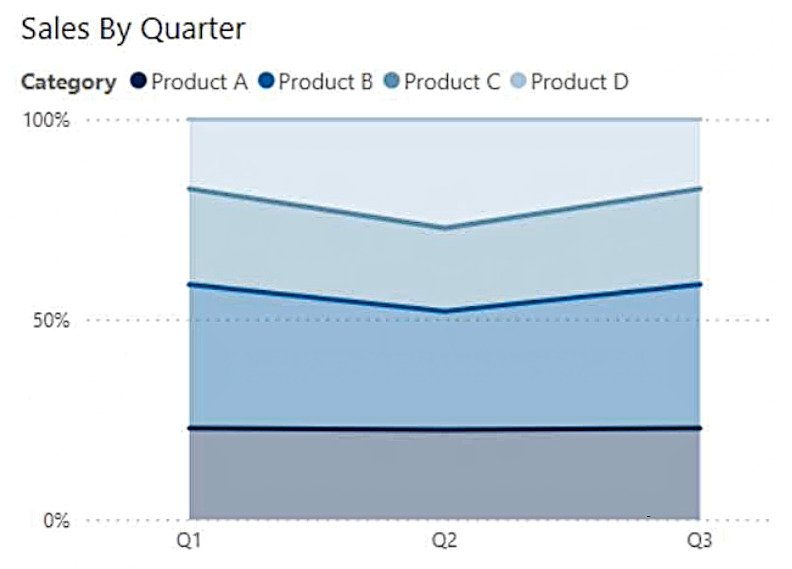
Community Votes
80% of anonymous learners picked answer C. Votes are pick records left by other test-takers — they are not the verified answer.
Community Insight
A 100% stacked area chart normalizes stacked areas to a full 100% axis by itself — the proportional quarterly mix the exhibit displays comes from the visual, not from hand-written percent-of-total measures.
Model1 has Sales and Quarter fields plus a sum measure, and the exhibit shows four product categories stacked to a constant 100% across quarters, so the visual type must reproduce that with no additional measures.
Reading the exhibit as a simple trend and picking a line chart — the y-axis runs 0% to 100% with categories stacked, which no plain line chart renders from Sales and Quarter alone.
Community Discussion (4 comments)
Comments & Corrections
No comments yet — spotted an error or have a note? Share it below.
Expert Analysis
Why the Answer Is Correct
The exhibit plots Product A through D stacked with a y-axis fixed at 0-100% over Q1-Q3 — the signature of a 100% stacked area chart (C). This visual computes the per-quarter proportion of each category internally, so the existing Sales sum measure and the Quarter field are all it needs; no additional DAX measures are required, exactly as the question demands.Why the Other Options Are Wrong
A line chart (B) draws one line per product on an absolute value axis — it shows trends, not the proportional whole the exhibit displays, and matching the 0-100% stacked appearance would require new percent measures. An area chart (D) stacks to absolute totals, not to a normalized 100%, so its axis cannot match the exhibit. A ribbon chart (A) is a ranked bar race across categories and axes — visually unrelated to continuous stacked areas.Community Comment Notes
A commenter describes the 100% stacked area chart as showing how constituent parts of a whole change over time with the y-axis always at 100%, matching the exhibit. The line-chart camp argues from trend analysis but overlooks the 0-100% stacked axis that defines the visual in the image.Official Reference
Related Analysis
Practice All PL-300 Questions
Access 116 questions with complete answers and detailed explanations.
View Full PL-300 Practice Test →