Accessible quota status: shape-differentiated icons for color-deficient users
You have a Power BI report that contains the table shown in the following exhibit. The table contains conditional formatting that shows which stores are above, near, or below the monthly quota for returns. You need to ensure that the table is accessible to consumers of reports who have color vision deficiency. What should you do? - 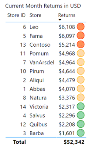
Community Votes
100% of anonymous learners picked answer C. Votes are pick records left by other test-takers — they are not the verified answer.
Community Insight
Color-deficient users can still distinguish shapes — keeping the icons but giving each status its own shape preserves the above/near/below distinction without relying on color alone.
A table uses conditional-formatting icons to mark stores as above, near, or below the monthly returns quota, and the formatting must stay understandable to consumers with color vision deficiency.
Removing the icons for red/yellow/green backgrounds — that swaps shape encoding for pure color encoding, which is the exact channel color-deficient users cannot use.
Community Discussion (5 comments)
Comments & Corrections
No comments yet — spotted an error or have a note? Share it below.
Expert Analysis
Why the Answer Is Correct
Accessibility guidance for color vision deficiency says never encode meaning in color alone. The current icons already differ in color; changing them so each status also has a different shape (C) adds a second, color-independent channel, letting color-deficient users read above/near/below status directly from the icon geometry.Why the Other Options Are Wrong
Moving the icons into a tooltip report (A) hides the information behind an interaction and does not fix the color-only encoding. Adding alt text listing values (B) helps screen reader users, but color-deficient users are sighted — they see the table and need the visual encoding fixed, not described. Removing icons in favor of red, yellow, and green backgrounds (D) replaces a shape-capable encoding with a purely color-based one, making accessibility worse.Community Comment Notes
A commenter observes that alt text mainly serves blind users while icons serve the color-blind audience, endorsing shapes over text descriptions. Another simply notes people with color vision deficiency can recognize shapes, which is the entire premise of option C.Official Reference
Related Analysis
Practice All PL-300 Questions
Access 116 questions with complete answers and detailed explanations.
View Full PL-300 Practice Test →