Color-vision-friendly themes: adjusting divergent and sentiment color palettes
You are configuring a Power BI report for accessibility as shown in the following table. You need to change the default colors of all three visuals to make the report more accessible to users who have color vision deficiency. Which two settings should you configure in the Customize theme window? Each correct answer presents part of the solution. NOTE: Each correct selection is worth one point. - 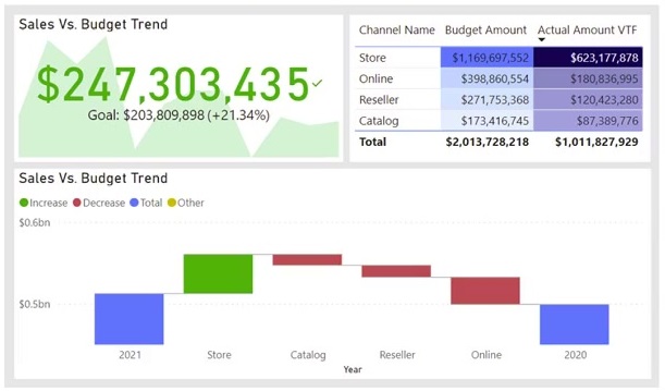
Community Votes
67% of anonymous learners picked answer BC. Votes are pick records left by other test-takers — they are not the verified answer.
Community Insight
Each visual's default colors come from a distinct theme palette: the table's gradient uses divergent colors, while the waterfall's increase/decrease and the KPI's good/bad colors use sentiment colors — changing those two palettes recolors all three visuals.
A report with three visuals — a KPI card with a goal indicator, a table using a blue-to-white conditional-formatting gradient, and a waterfall chart with green increase and red decrease bars — needs default colors changed for color vision deficiency through two theme settings.
Changing theme colors instead of sentiment colors — the general theme palette drives chart series colors, not the semantic good/bad reds and greens that cause the actual color-vision problem in the waterfall and KPI.
Community Discussion (6 comments)
Comments & Corrections
No comments yet — spotted an error or have a note? Share it below.
Expert Analysis
Why the Answer Is Correct
The screenshot shows the table's conditional formatting running on a diverging blue-white gradient, which the Customize theme window exposes as Divergent colors (C); adjusting that palette restyles the table for color-deficient users. The waterfall chart's green Increase and red Decrease bars and the KPI card's green goal indicator are governed by Sentiment colors (D), so adjusting that palette recolors both remaining visuals. Together C and D cover all three visuals' default colors.Why the Other Options Are Wrong
Theme colors (B) set the default series colors for standard chart visuals, but they do not control the sentiment palette behind waterfall increase/decrease and KPI indicators, so picking B alongside C would leave the waterfall and KPI in their problematic red-green defaults. First-level element colors (A) govern background, foreground, and surface colors of report elements, not the data-encoded colors the question targets.Community Comment Notes
A highly endorsed comment identifies the table's conditional formatting as divergent colors and the waterfall as sentiment colors, supporting C and D. A commenter favoring B and C claims sentiment colors hurt visually impaired users — but that is precisely why the sentiment palette must be changed, not skipped; their own description of the waterfall's red-green defaults confirms D is needed.Official Reference
Related Analysis
Practice All PL-300 Questions
Access 116 questions with complete answers and detailed explanations.
View Full PL-300 Practice Test →