Which Power BI components give KPI widgets and line charts?
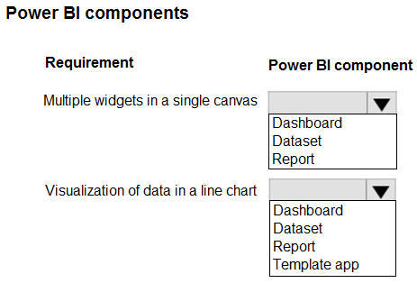
HOTSPOT
A company uses Power BI to report key performance indicators (KPIs).
The company requires that the KPIs contain the following:
• Multiple widgets in a single canvas
• Visualization of data in a line chart
You need to implement the Power BI components.
Which components should you use? To answer, select the appropriate options in the answer area.
Community Insight
The item tests whether you can separate the Power BI service's presentation layer (a dashboard is one canvas of pinned tiles; a report is a multi-page document of visuals), and the trap is assuming a report page can aggregate tiles from many different reports or that a dashboard can author a line chart by itself.
The PL-900 hotspot asks you to match two KPI requirements to Power BI components: a multi-widget single canvas and a line-chart visualization. The answer is Dashboard for the widgets-in-one-canvas requirement and Report for the line-chart visualization.
Choosing Report for both slots because reports can also show several visuals on one page; learners forget that 'multiple widgets in a single canvas' in PL-900 wording describes a dashboard of pinned tiles pulled from different reports and datasets, not a report page.
Community Discussion (5 comments)
Comments & Corrections
No comments yet — spotted an error or have a note? Share it below.
Expert Analysis
Why the Answer Is Correct
In the Power BI service a dashboard is exactly one canvas page made of tiles, and each tile can be pinned from a different report or dataset, so it is the only component that satisfies "multiple widgets in a single canvas" for company-wide KPI monitoring. A report is a multi-page document built on a single semantic model, and line charts are report visuals authored in Power BI Desktop or in the service. So the mapping demanded by the question is Dashboard first, Report second — the same pairing the majority of voters arrived at. Note that PL-900 consistently uses "dashboard" for the pinned-tile overview and "report" for authored visuals such as a line chart.
Why Other Candidate Answers Are Wrong
"Report and report" (the minority answer) fails the first requirement: although one report page can hold multiple visuals, those visuals must come from that report's own dataset, and the question's phrasing about a single canvas of widgets matches the dashboard definition. "Dashboard and dashboard" fails the second requirement: the service does not offer a standalone dashboard-authoring experience for new charts — a line chart must be created in a report (or generated through Q&A) and then pinned to the dashboard as a tile. A dataset or semantic model is not a presentation component and cannot display a line chart at all, so it cannot take either slot. Finally, a paginated report or a Power BI app is not the intended component here; an app simply distributes the dashboards and reports you already built.
Community Comment Notes
Consensus among voters is clear: yukikaze_503 wrote "I choose dashboard and report", with FreddyKruger1 and sibalkorean both agreeing. Cooljoy7777 gave the most useful reasoning, explaining the dashboard as "a single-page canvas made up of pinned tiles or widgets" that aggregate visuals from multiple reports and datasets, while reports hold detailed interactive visuals such as the line chart. The lone dissenter, d3a87a1, answered "report and report", which contradicts the standard Power BI distinction between a pinned-tile canvas and an authored report. Overall the comment thread aligns with the official Power BI component model.
Official Reference
Exam Strategy
When a PL-900 hotspot names a requirement, translate the wording before looking at the answers: "single canvas of widgets/tiles" is almost always dashboard, and "chart/visual built on a dataset" is report. Watch for distractor pairs that repeat the same component twice — the exam rarely wants the same answer in both slots.
Frequently Asked Questions
Why is a Power BI dashboard the answer for 'multiple widgets in a single canvas' instead of a report?
A dashboard is a single-page canvas whose tiles can be pinned from several different reports and datasets, which is what the KPI requirement describes. A report page shows multiple visuals but only from its own single dataset.
Can I create a line chart directly on a Power BI dashboard?
No. Line charts are authored in a report (or generated with Q&A) and then pinned to the dashboard as a tile. PL-900 therefore expects Report for the line-chart requirement.
Related Analysis
Practice All PL-900 Questions
Access 130 questions with complete answers and detailed explanations.
View Full PL-900 Practice Test →