How to Interpret a Velocity Chart for Project Scheduling?
Short answer
C The project is behind schedule.
Question
Key Takeaways
Tests interpretation of sprint velocity trends versus planned baselines, with the common trap being confusion between current performance lag and future project risk.
This question evaluates your ability to read a velocity chart and compare actual progress against a planned baseline. Community consensus confirms that when actual delivery consistently falls below the planned trajectory, the project is definitively behind schedule.
Common mistake: Option D (At Risk) is frequently selected because candidates overinterpret minor daily fluctuations as systemic failure, ignoring that consistent downward deviation from the planned line directly indicates being behind schedule rather than merely risky.
Expert Analysis
Why the Answer Is Correct
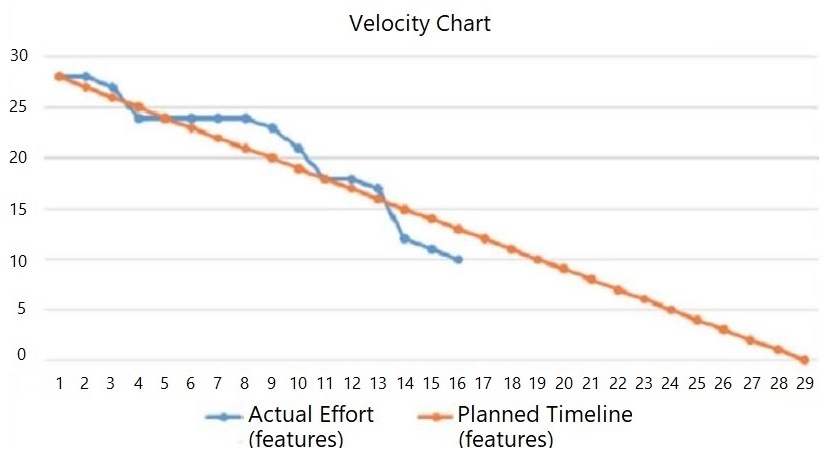
A velocity chart tracks completed work or remaining tasks against time to visualize delivery speed. When the actual data points fall consistently below the planned baseline line, it indicates that fewer features have been delivered than expected by that specific date. This direct, measurable deviation confirms the project is behind schedule, making option C the most accurate inference.Why the Other Options Are Wrong
Options A and B are immediately invalid because the actual performance line neither meets nor exceeds the planned trajectory. Option D acts as a strong distractor since sustained underperformance often increases future risk, but the chart explicitly displays historical lag rather than a probabilistic forecast. Certification questions require you to select the most direct observation supported by the data, not a speculative outcome.Community Comment Notes
Candidate [3] correctly identifies that the y-axis demonstrates actual effort lagging slightly below the planned timeline, which directly supports choosing behind schedule. Candidate [2] argues for option D based on a trend of more days below plan than above, highlighting how easily test-takers conflate current status with future uncertainty. These discussions reinforce the critical exam skill of distinguishing between measured performance metrics and projected risk indicators.Official Reference
- https://www.comptia.org/certifications/project-plus
- https://www.agilealliance.org/glossary/velocity-chart/
These links open the official vendor documentation in a new tab.
Exam Strategy
Always establish the planned baseline first and compare actuals directly against it before considering secondary factors like risk or scope changes. Remember that certification exams prioritize observable, data-backed conclusions over speculative projections when analyzing project management charts.
Community Votes
50% of anonymous learners picked answer C. Votes are pick records left by other test-takers — they are not the verified answer.
Discussion 4 contributions
Compiled from public community threads and reader submissions, lightly edited for clarity. Handles and vote tallies are shown as recorded, and comments reflect the views of individual contributors.
From public community threads 4
-
044f354 👍 1 Answered DI stand corrected. upon closer examination, I feel the project is [D. AT RISK] The tracked data points thus far: 3 - days performing at the planned rate of features 4 - days performing above planned rate of features 9 - days performing below planned rate of features THEREFORE: this Velocity Chart demonstrates a trend toward underperforming This project is at risk
-
stinkle 👍 1 Answered BDays of the month 1-29 and on the left, showing tasks remaining. I believe the project is ahead of schedule.
-
044f354 👍 1 Answered CY axis shows actual effort toward features is lagging slightly below planned timeline for features.
-
tduke 👍 1 Answered CShows project is behind schedule.
Reader comments & corrections
No reader corrections yet — spotted an error or have a note? Share it below.
Related Analysis
Practice All PK0-005 Questions
Access 102 questions with complete answers and detailed explanations.
View Full PK0-005 Practice Test →